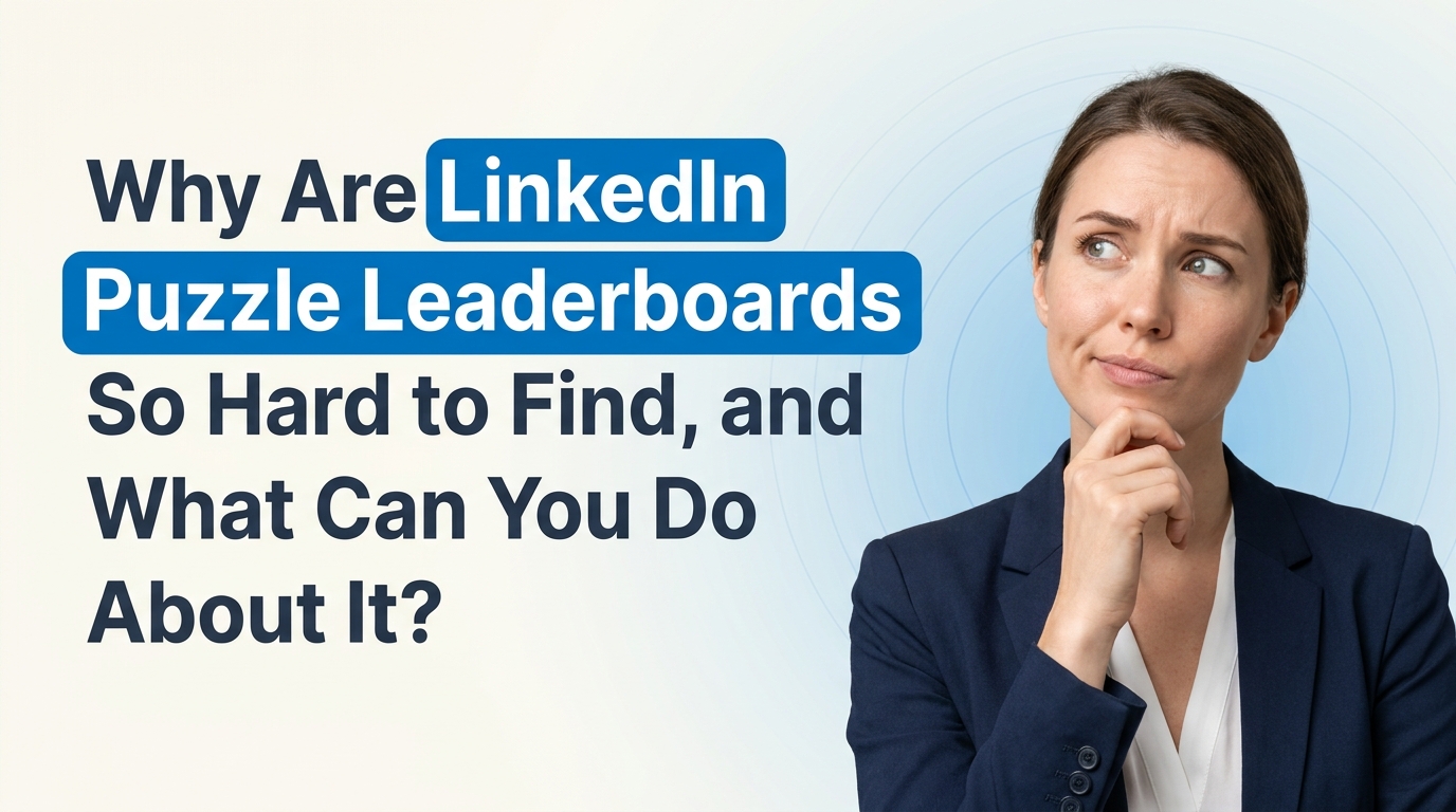
Why Are LinkedIn Puzzle Leaderboards So Hard to Find, and What Can You Do About It?
The rankings sit three or four taps deep after you finish a puzzle, so comparing scores with connections feels clunky. See why and what could change.
If you’ve ever opened one of LinkedIn’s puzzle games, finished your round, and then found yourself tapping around just to figure out how your score compares with other people, you’re definitely not alone. That frustration is real. The idea behind leaderboards feels simple: if a game includes competition, people should be able to see the rankings quickly. So when it takes three or four clicks just to find where you stand, it can feel a little clunky.
The short answer is yes, a lot of people probably feel the same way. LinkedIn games are designed to keep users engaged, but the leaderboard experience does not always feel as obvious or as smooth as it could be. If the point is to compare results with your connections, then making that feature harder to access creates a weird mismatch between the game’s purpose and the user experience.
Let’s break down why this happens, why it matters, and what LinkedIn could do better.
What’s the actual issue with LinkedIn puzzle leaderboards?
The concern is not really about the existence of leaderboards. It’s about visibility. When someone plays a puzzle game on LinkedIn, they usually expect a few things:
- A clear view of their score
- A quick comparison with friends, coworkers, or connections
- An easy way to return to rankings later
- A simple reason to come back and play again
When those things are hidden behind multiple taps, menus, or unclear navigation, the game becomes less satisfying. It stops feeling like a quick, social challenge and starts feeling like a small UI scavenger hunt.
And honestly, that matters more than it sounds. A lot of digital product experiences live or die by small friction points. One extra click might not seem like much, but three or four extra clicks in a lightweight game experience can be the difference between “that was fun” and “never mind.”
Is your profile ready for buyers who check you out?
Paste your profile link and see your score right away, with clear fixes for your headline, About section and experience. No account needed.
Or open the LinkedIn profile evaluator
Why would LinkedIn design it this way?
There are a few possible reasons, and none of them necessarily mean LinkedIn is ignoring users on purpose.
- LinkedIn is still a professional platform first. Games are a side feature, not the main product. Because of that, game interfaces may not get the same design attention as job tools, messaging, or content feeds.
- The platform may be trying to avoid a “too game-like” feel. Since LinkedIn’s brand is built around careers and professional identity, it may intentionally keep game competition a bit softer or less aggressive.
- They may be testing engagement paths. Platforms often experiment with how features are displayed to see what creates the most return visits or time spent in-app.
- UI simplification can backfire. Sometimes design teams remove visible elements to make a screen feel cleaner, but that can make important features harder to find.
So the issue may not be that LinkedIn doesn’t want people to use leaderboards. It may be that the leaderboard experience was designed as a secondary layer instead of a primary one.
Why does leaderboard visibility matter so much?
Because in games like these, the leaderboard is part of the reward. Solving the puzzle is only one piece of the experience. For many users, the fun comes right after that, when they get to ask:
- Did I beat my connections?
- How close was I to the top score?
- Who plays this regularly?
- Can I improve tomorrow?
If users can’t answer those questions quickly, the emotional payoff drops. And when the payoff drops, repeat engagement usually drops too.
That is especially true on LinkedIn, where social comparison works a little differently than it does on other platforms. Here, you’re not just comparing yourself with random players. You’re comparing yourself with colleagues, classmates, industry peers, and professional contacts. That social layer is the whole reason the leaderboard feels interesting in the first place.
Is this just a minor annoyance, or a real UX problem?
It’s a real user experience problem, even if it sounds small.
Good UX usually means people do not have to think too hard about where to go next. If a feature is central to the purpose of a tool, it should be intuitive to reach. In this case, if competition is part of the game mechanic, then the leaderboard should feel almost immediate.
Some fair UX questions LinkedIn could ask are:
- Can users see rankings right after completing a game?
- Can they access leaderboards again without restarting the entire flow?
- Is the leaderboard labeled clearly?
- Does the interface match what users expect from casual daily puzzle products?
If the answer to those questions is inconsistent, then yes, it’s more than just a random complaint. It points to a discoverability issue.
What would a better LinkedIn leaderboard experience look like?
If LinkedIn wanted to improve this, the fix would not need to be dramatic. A few practical changes could make a huge difference:
- Show the leaderboard immediately after puzzle completion. That should probably be the default screen after results.
- Add a persistent leaderboard button. Not hidden under extra layers, just visible and obvious.
- Highlight connection-based rankings first. Most users care more about how they compare with people they know than a global score.
- Include trend context. For example: “You moved up 3 spots from yesterday.”
- Allow one-tap sharing or inviting. This would make the social competition side more natural.
Those changes would keep the feature aligned with what users already expect: quick play, quick comparison, quick return.
Why this matters for engagement on LinkedIn specifically
LinkedIn is always balancing two things: keeping the platform useful and keeping it engaging. Puzzle games are one of those lighter-touch engagement tools that can bring people back daily without asking too much of them.
But for these kinds of features to work, the experience has to feel frictionless. If users sense that the fun part is buried, they are less likely to build a habit around it.
This connects to a bigger truth about digital platforms: features do not drive engagement by themselves; accessible experiences do. A leaderboard hidden behind several clicks is technically present, but practically weakened.
If you’re interested in how leaderboard systems affect user motivation more broadly, there are some useful reads on gamification and user behavior from sources like Nielsen Norman Group and Interaction Design Foundation.
So, are you the only one who finds this annoying?
No, probably not. In fact, this feels like the kind of issue that many people notice but do not always bother posting about. A lot of users will simply feel a little friction, maybe sigh, maybe click around, and then move on. But when enough people share that same small frustration, it usually points to a pattern worth paying attention to.
And that’s what makes this type of feedback useful. It’s not just complaining for the sake of it. It highlights where product design can better match user intent.
You played a game. You want to see where you rank. That should be easy.
What can users do in the meantime?
Until LinkedIn improves the flow, there are only a few realistic things users can do:
- Send product feedback through LinkedIn’s help or in-app feedback tools
- Watch for interface updates, since LinkedIn often tests and changes features gradually
- Engage with discussions from other users who are noticing the same issue
- Keep track of what leaderboard access flow works best on desktop versus mobile, since experiences sometimes differ
If you want to better understand how LinkedIn rolls out and adjusts features, LinkedIn’s own official blog is sometimes useful: LinkedIn Official Blog. And if you prefer video breakdowns of product design and UX patterns, a general resource like Nielsen Norman Group on YouTube can also be helpful.
Final thoughts
The complaint about LinkedIn puzzle leaderboards being too hidden is fair. It may sound minor at first, but it gets at something important: when a feature is built around social competition, the social comparison layer should not feel buried.
People are not asking for a major redesign. They just want the experience to make sense. Fewer clicks, clearer ranking visibility, and a smoother connection-based leaderboard would make these games more enjoyable and probably more sticky too.
Small usability issues often reveal bigger lessons about digital engagement, interface clarity, and how people actually use platform features in real life. That is the kind of thing brands, creators, and companies should pay attention to when building a presence on LinkedIn as well.
At EXEED Digitals, we spend a lot of time helping brands understand how people behave on LinkedIn, what keeps them engaged, and where platform friction affects performance. If your team is trying to improve visibility, engagement, or platform strategy, you can learn more about our services here: EXEED Digitals Services. As a LinkedIn agency, EXEED Digitals usually supports businesses through exactly these kinds of platform-related concerns, and our LinkedIn services have helped 100s of brands grow stronger, smarter presences on LinkedIn.
en